Creative Thinking
What Is Typography? An Executive Summary for Content Marketers
By Taylor Holland on August 18, 2017
Remember when marketers could say, "That's not my job. I just do branding"? Yeah, me neither.
Modern content marketing leaders need to be well-versed in a wide range of topics: marketing automation technology, data analysis, search engine optimization, video, VR, graphic design. Considering that many of us come from writing backgrounds, there's a lot to learn.
Here's one more for the list: typography.
Don't worry. This is not a beginner's guide to typography or a do-it-yourself tip sheet. Both my graphic designer friends and my personal experience have convinced me that amateurs shouldn't be playing around with art forms they don't understand—at least not for professional use. And I can empathize. I tend to get a little prickly when people start their own blogs and suddenly call themselves professional writers. Learning a craft like typography takes training, experience, and lots of practice. And quite frankly, ain't nobody got time for that in the marketing department.
For most content marketers, design is not a part of the job description, but storytelling is. And now more than ever, that's a job that can't do without strong visuals.
Typefaces play an integral role in how messages are received, and no one is closer to a brand's message, values, audience, and story than the content marketing team. Sure, designers generally handle typeface selection and creation, but it's also a smart idea for marketers to be part of the visual design conversation.
For that, we need at least a basic understanding of typography—lest we get lost in translation or make fools of ourselves. Just tell a graphic designer that your favorite font is Comic Sans and see what happens. Unless your friends are nicer than mine, they'll either laugh at you or look at you with a unique blend of pity and scorn on their faces. (My fellow southerners know it as the "bless your heart" look.)
So, what is typography, and why should content marketers care?
What Is Typography?
Typography is the art of arranging type, including letters and characters. It's more than just choosing the right typeface. It also involves selecting the right size, style, and weight of the right typeface. It involves pairing complementary typefaces, and spacing letters, words, and sentences in a visually pleasing way.
Sounds complicated, right? It is.
Ten years ago, my father asked me to design a pamphlet showcasing a beautiful lodge that my aunt and uncle owned and rented out for weddings. I was a journalist who did some marketing writing on the side, so I was certainly qualified to write the copy, and I assumed I could figure out the layout part. I'd seen the graphic designers at work do it, and it really didn't look all that hard.
I opened Microsoft Word, chose a template, inserted my pictures, and added some text boxes. Then I chose some fonts. That's where everything fell apart. I fiddled with the fonts . . . and fiddled with them . . . and fiddled with them. Still, the pamphlet looked terrible. I couldn't put my finger on why, but I knew it didn't look right.
When I showed it to a couple designer friends, I learned that I'd made two fatal errors:
- I used the wrong tools. (Want to really make a designer laugh? Forget Comic Sans. Tell them you designed something in Word. That'll get 'em rolling on the floor.)
- I didn't know what I was doing.
I quickly learned that making words look good on a page takes more than choosing a suitable font in the right size. Typography is an art form. And like any true art form—writing, photography, painting, parenting—people who are good at it make it look effortless, even though it's not.
Typography isn't easy, but it is important. Within a particular image or layout, good type is the difference between a professional-looking product and one that a twenty-four-year-old writer made using Word. For the overall brand experience, typeface consistency is just as important as quality.
I like this explanation from Monotype:
A brand's type reflects its story—the who, what, and where behind the product—and that story is the cornerstone of a brand's authenticity. Implementing typefaces consistently helps create a unified visual identity that supports and reinforces that story. Just as importantly, a brand's typeface reassures the customer that she is operating within your brand's ecosystem no matter where she is. This maintains and strengthens that essential connection between brand and customer, and creates the expectation of a reliable customer experience.
Typeface consistency is also important because designers put a lot of thought into which ones evoke the emotions, values, and tone that brands want to communicate. And that is a conversation marketers want to be part of. But first, you need to know the lingo.
There's a Difference Between Typefaces and Fonts (It Was News to Me, Too)
If you actually want to do typography, there's a lot of terminology to learn—kerning, leading, hierarchy. But that's a whole other article (or perhaps, textbook) in itself.
There are, however, a few important distinctions to know if you just want to talk about it intelligently—starting with the difference between font and typeface. Those of us who didn't go to art school tend to use the words interchangeably, but there's a difference for designers.
Here's how HubSpot's "Typography Tutorial for Beginners" distinguishes between them:
Typographer, Nick Sherman, once used a great analogy to explain the differences between the terms "typeface" and "font." He suggested comparing these typography terms to the musical terms "song" and "mp3." When you're explaining how much you enjoy a particular tune, you say, "I love this song!" You wouldn't say, "I love this mp3!"
The song is the work of art, whereas an mp3 file is just the delivery mechanism.
The same rules apply in typography. You should use the word "typeface" when describing the creative work ... the way a specific collection looks or feels. For example, Helvetica is a typeface.
If you're describing the physical embodiment of the collection of letters and characters, you should use the term "font." It refers to what you use—whether that's a file on your computer or a case full of metal letters. For example, Helvetica Bold and Helvetica Light Oblique are fonts.
The next thing to wrap your head around: type classifications.
4 Common Types of Type—and What They Say About Your Brand
I'm going to level with you. This is where it gets complicated. There are many different type classifications, each characterized by unique stylistic elements, and many different typefaces in each classification. Then there are typefaces that fall into more than one classification. Add to that the fact that different experts use different words to describe the classifications, and things get a little murky.
The good news? Content marketers don't need to dive quite that deep. Here's a high-level overview of the most common type classifications:
1. Serif
Distinctive stylistic elements: presence of serifs
Popular typefaces: Times New Roman, Georgia, Garamond

Serif and sans serif comprise the most common type classifications. The difference between the two lies in the presence or absence of serifs—decorative lines or swirls that appear at the ends or corners of certain letters.
Books and magazines often opt for serif typefaces, because the distinctive letters are easier to read in long, printed works. And because they appear in books and magazines—you know, old school media (sigh!)—they present an air of sophistication, respectability, and comfort. This makes serif typefaces an excellent option for brands that want to project stability—such as IBM, NASA, and Wells Fargo—and for luxury brands such as BMW, Louis Vuitton, and Tiffany & Co.
2. Sans Serif
Distinctive stylistic elements: absence of serifs
Popular typefaces: Helvetica, Calibri, Arial, Verdana, Futura

French for "without serifs," sans serif typefaces have cleaner lines and a more modern look than serif typefaces. This makes them popular choices for body copy in web design, because they're easier on the eyes on a computer screen.
They're also the most popular typefaces for brand logos. In 2015, when Google formed Alphabet, the company changed its 16-year-old logo from a serif to sans serif typeface. As Wired magazine put it at the time, the new design is "simpler, younger, friendlier, and—dare we say—more visually in line with Alphabet, Google's new holding company." In other words, Google was changing its brand from a company you could trust with your data to a company you could expect to innovate. And that required a new look and feel, which required a new typeface.
3. Blackletter
Distinctive stylistic elements: dramatic variation between thick and thin lines, elaborate serifs
Popular typefaces: Gothic, Fraktur, Cloister Black

Blackletter isn't the most popular type classification, but it is one of the oldest. Blackletter was developed by Johannes Gutenberg for use in the famous Gutenberg Bible, one of the first books ever printed in Europe.
Because blackletter typefaces can be challenging to read, you rarely see them these days, and almost never in body copy. But the rich history and bold lines suggest a sense of tradition and reliability that make blackletter typefaces popular for newspapers—including the New York Times and Los Angeles Times—and for brands that want to make a bold statement, like beermaker Corona.
4. Script
Distinctive stylistic elements: looks like handwriting
Popular typefaces: Dancing Script, Edwardian Script, Comic Sans

Script typefaces mimic handwriting. There are formal (or calligraphic) script styles—like what you'd see on a wedding invitation—and casual (or handwriting) script styles that look more like print handwriting, including my once-beloved Comic Sans.
Though script typefaces are almost never used in body copy, many popular brands use them for logos. The right script typeface suggests friendliness (Coca-Cola), creativity (Pinterest), playfulness (Barbie), or elegance (Cadillac).
Now What?
Why are there so many different typefaces? Because human beings—and brands—have a lot to say, and visual design is an important part of how messages get conveyed. And when the right typeface doesn't already exist—or when brands want to be extra creative—they make up a new one.
As Comic Sans creator Vincent Connare once told the Guardian, "A typeface is an answer to a question. Everything I've ever done is a solution to somebody's problem." The problem he was solving, by the way, was to create a comic-book-esque typeface for Microsoft Bob, a much-maligned (and short-lived) user interface featuring cartoon digital assistants. And the poor guy has never lived it down.
Of course, you don't have to create your own typeface. You just have to find one that works for your brand. So, what do you want your type to say about your company?
For more stories like this, subscribe to the Content Standard newsletter.

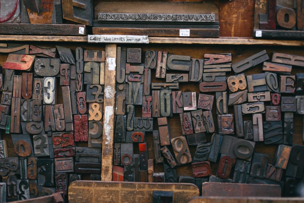
Featured image attribution: Bruno Martins
Related Articles
Keep Reading...
Related Posts


How to Master Omnichannel Marketing with Seamless Data Storytelling
Monday, April 1, 2019
Creative Thinking