Content Strategy
How Brands Use Data-Driven Content to Tell Better Stories
By Krystal Overmyer on March 19, 2018
Two out of three marketers' lives will change after reading this story.
Sure, the above statement isn't exactly based in fact. But if a statement like that catches your attention, it's because of the special appeal of data and facts. Data-driven content is all about using fascinating facts to tell unusual, creative, and head-turning stories.
Journalists have been on the data-driven storytelling bandwagon for years, and marketers have often followed suit, delivering original research via white papers or infographics. But those content vehicles, while trustworthy tools in the content arsenal, are just the beginning of great data-driven content.
Really great content marketers are often data nerds. Collecting, analyzing, and responding to data are crucial activities to strengthen your content marketing strategy. It's time for marketers to also recognize the power of data to generate new and amazing content. Data-based stories can be shared in a variety of formats-from marketing emails to blog posts to special data-powered, interactive digital features.
The Power of Data in Stories
For an example of a data-driven storytelling success story, look no further than FiveThirtyEight, an online publication covering politics, sports, science, economics, and popular culture through the lens of data and statistical analysis. Thanks to presidential election coverage, FiveThirtyEight's traffic more than tripled in a one-year period, from 3.6 million unique visitors in March 2015 to 11.5 million a year later, according to Variety.
What compels such intent interest in data-driven stories? According to Stanford University marketing professor Jennifer Aaker, stories become meaningful when they are "memorable, impactful and they personally connect." Stories are memorable in a way than statistics aren't. But that doesn't mean that stats don't matter. Rather, data and great storytelling go hand in hand. "When data and stories are used together, audiences are moved both intellectually and emotionally," she says.
Clearly, marketers know that data is important. But when it comes to using data to tell stories, they sometimes miss the mark and forget for whom the story is intended.
"Rather than asking, What does our audience care about and what do they want to understand in more depth? I see marketers asking, What topics are going to shed the best light on our brand and get us the most attention for X product?" says Clare McDermott, cofounder of Mantis Research, a consultancy that helps brands produce and publish original research.
Like all great content, great data-driven content should start with the audience in mind. What kind of information does your customer need to solve a problem in her life? What data can you provide that would enlighten her area of interest? One way to get at the answer to these questions is by thinking about your dream headline or tweet, as writer and researcher Alexandra Samuel suggests in Harvard Business Review.
For a personal finance software company that suspects millennials are underprepared financially, the dream headline might be "80 percent of millennials aren't saving enough for retirement." Though the subsequent research very likely won't match your dream headline, the exercise creates a starting point. Once you know what headline you want to deliver to your audience, you can figure out how to approach the topic through research.
Data-driven stories can also come from unusual places. Companies don't need to launch large surveys to create data-driven content. Brands can use data they already have at their fingertips to enlighten their audience about interesting trends or behaviors.
Look For the Unusual
Really great data teaches us something new or unexpected. For example, data might reveal something counterintuitive, like the fact that long-form content can outperform short-form content, even in this time-crunched world.
Alternatively, data might reveal something surprising or humorous about the eccentricities of humanity. In a hilarious blog post, dating site OKCupid paid tribute to the wide variety of dating usernames deployed on the site, including gems like StayingPawwsitive, Britney__Tears, and unicorn__jizz.
OKCupid dug deeper into the username data to find even more awesome trends. For example, usernames incorporating the word "cat" (about 888,000) vastly outnumber dog-related user names (about 138,000). A hearty 221,000 people elected to use "sexy" in their username.
Similarly, Spotify utilized unusual user behavior to fuel a humor-laden marketing campaign. They gently poked fun at quirky playlist names or peculiar listener behavior, like calling out an anonymous user for listening to Justin Bieber's "Sorry" 42 times on Valentine's Day.
.@Spotify builds more funny ads around user #data, this time saluting goofy playlist names: https://t.co/YjM6oJnQDm via @Adweek pic.twitter.com/K2cH7wiODK
– FAST WEB MEDIA (@FastWebMedia) February 17, 2017
Data nuggets like these resonate because they reveal something unexpected about the world around us. Even something as simple as a username can ultimately make for interesting data-driven content.
Find Patterns or Trends
Surveys often discover startling patterns and trends that generate great content. Moreover, conducting original research and reporting can help establish your brand as an authoritative, expert voice in your industry. HubSpot, a research powerhouse, produces marketing trend reports across a breadth of topics-one unifying theme is an emphasis on visual elements like charts and graphs to help tell the story.
Original research can be tricky, however. One mistake companies often make, McDermott notes, is not using a data scientist to vet and test the survey. If your audience can't trust the insights you're describing, your authority goes bust.
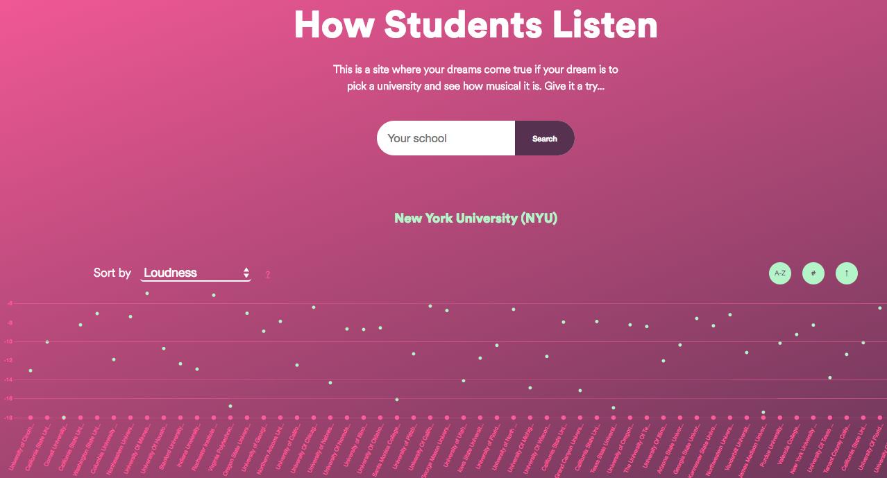
Customer data can play an equally powerful role in developing data-driven stories. Ever the data powerhouse, Spotify created an interactive tool to allow users to compare music listening trends at their university versus others.
Even light-hearted data analysis can create a positive splash. Facebook's revelation that more people use "haha" than "lol" wasn't earth-shattering news, but it's the type of content that snags media attention and gets people talking, as Samuel notes in Harvard Business Review.
Get Personal
People love learning about themselves and their habits; it's why apps that track our sleep, steps, spending, travel, and more are so popular. As marketers, most likely you're already using the data you've collected from customers to inform your marketing strategy and campaigns. This same content can also drive stories. You can beam some of the data you collect back to the customer, giving them insight into their own behavior.
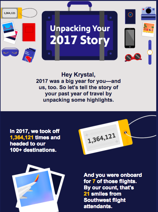
Southwest Airlines, for example, generated a personalized "annual report" email with a nifty graphic detailing key facts about my interaction with the brand. Interspersed with company-wide data, the infographic incorporated information about how many trips I'd taken, a few of the destinations visited, and the points I'd earned on the flights.
The email piqued my interest by aggregating a year's worth of trips with the airline and generating data I wouldn't have put together on my own. Of course, this content marketing strategy wouldn't work for every brand-consumers may prefer not knowing how much time they've spent on Netflix or how much money they've spent with Amazon.
Consider the Format
Once you've identified your compelling data and formulated a story around it, it's important to consider how you'll deliver the information. Data visualization is one way to convey meaning in a clear and meaningful way. McDermott notes that data visualization doesn't mean making something more ornate; rather, the point is creating a visual story that is clean, correct, and tells an interesting story. "It's all about clarity and coherence rather than being loud and flashy," she says.
McDermott says she often helps clients "turn down the volume" on data graphics through tricks like using a monochromatic color palette (to ensure the color choices don't detract from the story) or matching the correct chart or graph to the data. Pie charts, she said, are frequently used but are often not the most effective choice.
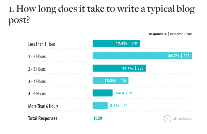
Orbit Media's annual blogger survey showcases McDermott's less-is-more philosophy. The graphics aren't flashy, but the meaning is clear.
Infographics, charts, and graphs aren't the only content types for data. McDermott said brands that create original research can slice and dice the data into a variety of content formats-reports, webinars, videos, live events, and more. "Some of our clients undertake a single research project per year, and the results from that research feed their content programs for the entire year," she says.
Data-driven content can help brands draw attention to their efforts and enhance their credibility and authority in their industry. No matter if it's a survey or owned data analysis, data-driven stories can enhance your content marketing strategy.
For more stories like this, subscribe to the Content Standard newsletter.
Featured image attribution: Nope Nope


