Content Creation
Visual Identity Essentials: What’s Behind the Perfect Brand Look and Feel
By Ashley Holland & Shannon Curley on March 5, 2021
If a picture is worth a thousand words, then your visual identity is worth a million of them. It's one of the best ways your brand can present a cohesive image that inspires audiences, makes them feel seen or like they're part of a special community. But what role does visual identity play in winning consumers' loyalty and influencing their brand choices?
Well, consider these two facts: Ninety-five percent of purchase decision-making occurs on a subconscious level, and consumers make up their minds about a brand almost instantly based on its visual identity. Studies show that people:
can process images in as little as 13 milliseconds.
form an opinion about a webpage based on its visual appeal within 50 milliseconds of seeing it.
- assess a brand largely based on the color palette it uses.
No pressure, right?
In this guide, we'll show you how to create a visual identity that accurately represents your brand's personality and effectively engages your audience. You'll learn why color, typography, imagery, and page layout matter, as well as how you can use these elements to convey your brand's mission, vision, and values.
What Is Visual Identity?
Visual identity is an umbrella term that encompasses every visual element of a brand, from its color palette and its typography to the layout of its website and its marketing materials. Together, these elements create a visual identity that serves as the symbolic meaning of a brand. A strong visual identity allows an organization to put out the right message about its purpose, mission, and values. It also influences how audiences perceive the brand and its adherence to those core principles.
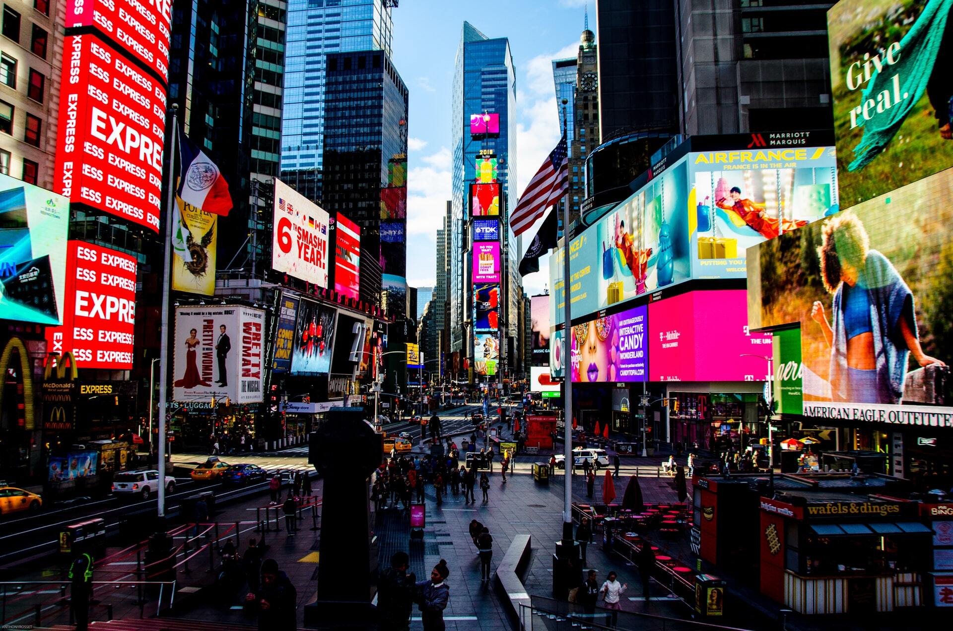
Image attribution: Anthony Rosset at Unsplash
When it comes to content marketing, visual identity's importance is paramount. Without giving your visual identity its due attention, you could be misrepresenting your brand and everything it stands for. In turn, your audience may gain vastly different stories from your content than the ones you were actually trying to tell.
Your visual identity is reflected through an entire ecosystem of media, which can include a website, social media prescence, advertisements, blogs, videos, micrographics, infographics, e-books, and more. Collectively, these touchpoints convey your key values, products, and messages in a way that becomes the signature of your brand.
Why Is Visual Identity Important?
Your visual identity instantly transmits your brand's personality and values to its audiences. A well-executed visual identity triggers immediate affinity with customers and prospects. Visual inconsistency, on the other hand, conveys uncertainty—or worse, negativity—and it can make your readers, customers, or clients unsure of your brand or even mistrust it. A consistent, purposeful visual identity supports your overall brand health in three major ways:
It conveys your brand's mission and value. The most engaging and iconic organizations treat visual identity as an extension of their brand's personality. Walking, talking, and dressing purposefully as a brand shows that you're confident in your central goals and mission.
It resonates with your audience. The power of visual identity is its ability to instantly spark affinity with audiences. Whether you're trying to reach specific demographics (single parents ages 20–30 living in Denver, for example) or more abstract personas (such as elite athletes who want to get the most out of their workouts), your visual identity is a way to show you understand your audience's emotional needs and share their values.
It reflects your cultural relevance. Just like words, visuals are products of our sociocultural and historical context; they're also the way that brands contribute to their audience's cultural context. Visual identity has the power to evolve with your audience, demonstrating your brand's cultural relevance as the world around it changes.
Establishing a consistent and powerful visual identity isn't just about using the same colors on your website and your Facebook page, though. It's about ensuring that the images, colors, fonts, and other visual elements you use support each other across mediums. Additionally, it's making certain that these elements accurately reflect your brand's personality and the value you bring to audiences. If your website visitors can quickly determine what's at the heart of your business before they've even read a word, then you're doing something right in the visual identity department.
When Do You Need a Visual Identity Analysis?
There are many situations that warrant a visual identity analysis. Some of these use cases include when you're:
undergoing a rebrand
launching a new site
synthesizing content across multiple platforms/pages
syncing design approaches across creative agencies
launching a social media campaign
exploring new visual content types (video, infographics)
creating brand consistency after a merger
Whether you're starting from scratch or tweaking an existing style guide, you'll need to maintain a dynamic visual approach with your content to ensure your overarching visual identity is reliable and ownable.
In the following sections, we break down the elements of visual identity where your brand might need a tuneup. As you review each of them, reflect on your business plan, mission statement, and vision statement. Then, carefully analyze your media ecosystem, ensuring that each element is used in a thoughtful, effective way that conveys your value. If that's not the case, it's time to make some adjustments.
The Elements of Visual Identity
Visual identity is all about the whole being greater than the sum of its parts. To truly understand, identify, and address visual identity, you must consider how a brand uses its color, typography, imagery, and spatial relationships. There are other elements you can explore as functions of visual identity, but these are at the core of every smart branding strategy.
1. Color Palette
Color is the most foundational element of a brand's visual identity. It's the thing that audiences tend to remember most about an organization; and when it's used effectively, it can even become symbolic of a brand. Case in point: When you think of Coca Cola, a bright saturated red likely comes to mind. And when you think of its competitor Pepsi, a bold blue probably pops into your head. Although these iconic companies rely mostly on a handful of solid colors to convey their brands' personalities, others use more complex color palettes and hierarchies to tell consumers about who they are.

Image attribution: Clem Onojeghuo at Unsplash
The Power of Color: Evoking Emotion
Because colors hold such strong emotional meanings, they have an immediate effect on how we process something and how we react upon seeing it. A brand that wants to come across as bold, powerful, and passionate might opt for red, Iconic Fox notes, whereas one that wants to convey warmth and optimism might use yellow as their primary color.
Connotations
Color meanings are almost entirely reliant on social and historical context. Just check out this graphic from Information Is Beautiful to see how colors can have drastically different meanings depending on your culture. For example, love is associated with red in American culture, green in Hindu culture, and yellow in Native American culture. However, just as cultural norms constantly change so, too, do color connotations.
Even within the same culture, a color can carry multiple—and sometimes conflicting—connotations. Be warned: You'll need to use the right hue, saturation, and contrast to accurately convey your brand message. In the United States, for example, purple typically conveys wisdom and wealth, but it can also represent decadence. If you're a bargain-focused company that wants to reach money-savers, using purple might send the wrong message to your audience and ultimately undermine your brand's goals.
According to Iconic Fox, here are some other common color connotations in the U.S.:
Red: intensity, fearlessness, excitement, warning, danger
Blue: reason, strength, alertness, wisdom, loyalty, dependability
Orange: creativity, enthusiasm, courage, risk
Green: health, hope, stagnation, openness, freshness
Black: security, power, authority, coldness
Yellow: youthfulness, happiness, fun, impulsiveness
Purple: wealth, sophistication, imagination, excess
Pink: imagination, passion, care, creativity, flippancy
White: cleanliness, purity, innocence, plainness, distance
Context and Contrast
Color connotations depend on the context you give them, too. In the U.S., green means go and conveys naturalness. Red, on the other hand, means stop and symbolizes excitement. When colors have so many different meanings, how can you ensure the ones you choose actually mean what you want them to mean? The answer is by controlling their context and contrast. A HubSpot study found that when used on call to action buttons, red outperformed green by 21 percent. Because of the button's position and its contrast with the colors around it, site visitors were more inclined to click on the red button because they saw it as more exciting than the green button.
A foundational study published in the American Journal of Psychology found that viewers are more likely to remember and engage with items that stand out dramatically from those surrounding them. Otherwise known as the isolation effect, this principle proves that the location and contrast of colors are equally as important as the colors themselves.
What This Means for You
Of all your visual elements, color is the one that's most responsible for whether viewers like, dislike, trust, distrust, or ignore your brand. One study found that the effectiveness of a brand's color palette depends largely on customer opinions, and whether they feel the colors are appropriate for the product. The lesson here? Don't just settle on an appealing color palette. Instead, pick one that helps you achieve brand congruity.
When choosing the colors that'll represent your brand, pick ones that reflect your organization's mission, vision, and personality. Also, pay attention to how you hierarchize these colors; your palette should host a cast of characters, but not every color can be center stage. Pick the right star for your palette and be strategic about how you use it and its supporting colors, considering how they fit into the context of your overall page and site.
Color Terms You Should Know
Color contrast: the difference in tone between one color and another
Color hierarchy: the dominance of certain colors over other colors, referring to the ways colors do or do not stand out among each other
Color psychology: the study of how colors make people feel and how people respond to colors
Hex code: a measurement of a color based on its hexadecimal value
Palette/scheme: a selection of coordinating colors
When assessing your brand's use of color, consider these critical questions:
What do your brand's colors tell you about your organization's personality? Does this align with your strategic goals?
How does your brand's color palette compare to those of your industry competitors? Is yours standing out enough? Is it standing out too much?
In what scenarios will you use color to drive action on your site or in your marketing materials? Are the colors you're using likely to support the actions you want your audience to take?
How does it all come together? Are your colors balanced? Do they look like your brand?
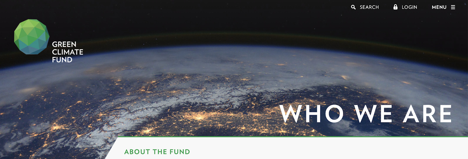
Who's Getting It Right
The Green Climate Fund is a coalition of 194 countries actively working to address climate change—and its color branding reflects just that. Its green and blue logo immediately recalls its primary concerns: earth and water. By contrasting the logo with stark white and deep black elements on its website, the Green Climate Fund strategically uses the isolation effect to its fullest.
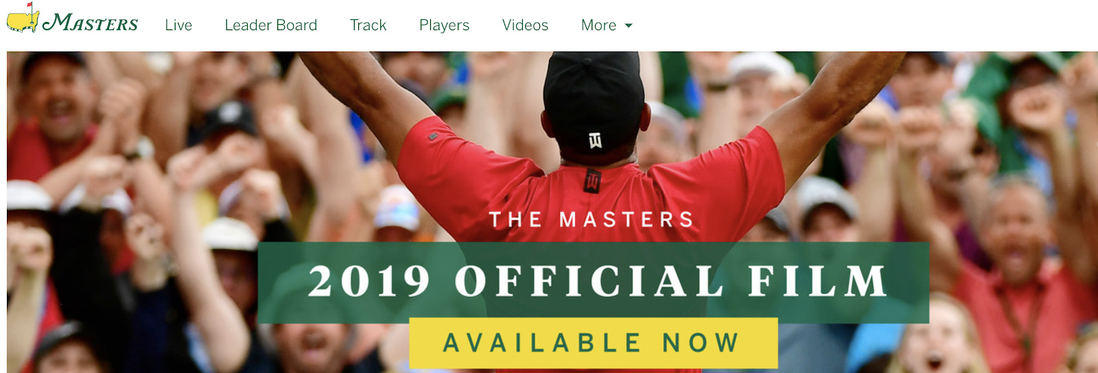
Who Needs Some Work
Although the green in the Masters color palette accurately reflects a pristine golf course, its contrast with yellow detracts from the prestige of the tournament. In fact, 22 percent of respondents rated yellow as a "cheap" color in one study, and 26 percent deemed orange as the cheapest looking color of them all. The use of yellow, especially in combination with green, undermines the elite athleticism and sophistication that the tournament is supposed to represent.
2. Typography
Text tells us something, but it also shows us something. The letters in the alphabet, and the words that are created from them, are just as visual as they are textual. Their visual aspects—how they appear on a page or screen—tell us something about the meaning behind them, whether that's intended or not.The Power of Typography: Personality and Clarity
Fonts have distinct personalities. They can be stoic, humorous, serious, or even whimsical. And their personalities can change over time. In fact, different fonts have been popular at different times, and they each carry that historical weight with them today.
In 2012, Errol Morris conducted an unofficial study in The New York Times that measured 45,000 readers' responses to a claim written in six different typefaces: Computer Modern, Georgia, Helvetica, Trebuchet, Comic Sans, and Baskerville. Morris asked readers to note whether they believed the claim was true or false. The result? People were more likely to believe the claim was true when it was written in Baskerville.
A serif font historically used in newspapers, Baskerville has a reputation for seriousness, truth, and sophistication. Comic Sans, on the other hand, does not. It's no surprise that the visuality of the Baskerville claim encouraged readers to trust the words therein.
Typography conveys your brand's personality, but it also has a critical impact on the effectiveness of your messages.
Here's a breakdown of some common typefaces and their histories:
Serif typefaces:
Old Style
Examples: Adobe Jenson, Goudy Old Style
Characterized by: a diagonal stress on the thinnest part of the letters; common in newspapers and magazines
Dates back: to the 1400s; the oldest serif styles
Qualities: sophisticated, serious, wise
Transitional
Examples: Times New Roman, Baskerville
Characterized by: a vertical axis of symmetry
Dates back: to the 1700s
Qualities: traditional, straightforward
Neoclassical/Modern
Examples: Didot, Marconi
Characterized by: the significant differences between thick and thin strokes
Dates back: to the 1700s
Qualities: contemporary, fresh, wise, confident
Sans-serif typefaces:
Grotesque:
Examples: Venus, News Gothic
Characterized by: their similarity to serifs, but without the serifs; good for titles and headlines
- Dates back: to the 1700s
Qualities: authority, boldness
Neo-Grotesque:
Examples: Helvetica, Roboto
Characterized by: their similarity to grotesque, but plainer in appearance
- Dates back: to the 1900s
Qualities: straightforward, precise, clean, basic
Humanist:
Examples: Verdana, Calibri
Characterized by: their low X-height and low contrast between strokes
- Dates back: to the 1400s
Qualities: Soft, straightforward
Geometric:
Examples: Gotham, ITC Avant Garde
Characterized by: their geometric look, especially in O-shaped letters
- Dates back: to the 1900s
Qualities: Modern, clean but playful, full, rich
What It Means for You
Choosing a font family that resonates with your brand, your color palette, your logo, and your images helps convey your company's personality and reinforce the sentiment behind each message to your audience.
But it's not just the font that affects the meaning of your messages. The location, size, shape, color, and contrast of words all contribute to how readers understand them. Even within this white paper, we've bolded certain words, italicized others, and adjusted the size of certain lines to help you move more easily through the content and pull out information in the process. Without even reading the text, you likely know which lines are headings, which words are the most important, and which phrases indicate section breaks. You've gathered this information visually, not just textually. That's the power of typography.
Typography Terms You Should Know
- Serif: the feet of a letter, which can be rounded or squared
- Sans serif: fonts with letters without feet
- Typeface: a group of type styles with similar basic qualities
- Stroke: the lines within a letter, not including the serif
- Font weight: the thickness of the strokes within a font
- Ascender: any strokes that rise above the median line, such as the upper halves of the letters l, h, and f
- Baseline: the horizontal line that runs along the bottom of letters
- Cap height: the height of a letter from its baseline to the top of its ascender
- Descender: any strokes that fall below the baseline, such as the lower halves of the letters p, q, and y
- Median line: the horizontal line that runs along the top of lowercase letters
- Kerning: the process of manually adjusting the spacing between individual letters in a word for readability and style
- Leading: the process of adjusting the space between lines
- Tracking: the process of manually adjusting the spacing between all letters in a word uniformly for readability and style
- Typographical hierarchy: How text is prioritized on your page to emphasize importance
- X-height: the height of a lowercase letter from its baseline to its median line
When evaluating your brand's use of typography, keep these questions in mind:
How did you choose the fonts for your brand? What does your font selection say about your content?
Does your typography inspire any emotions or thoughts? Are these in line with your brand's personality and strategy?
How do your typographical choices compare with those of your competitors? Do they help your brand stand out or blend in?
What does your typographical hierarchy tell your audience about your priorities? Are the right messages standing out?
Is your brand using typography intentionally and thoughtfully?
Who's Getting It Right
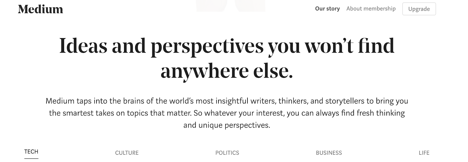
In 2012, Twitter cofounders Ev Williams and Biz Stone launched Medium, a popular publishing platform that believes "words matter." Their site uses a Transitional typeface on headlines to convey an approachable but trustworthy tone, and a Humanist sans serif font (Freight Sans) as paragraph text to exude a warm and inviting appearance. It also employs a strong typographical hierarchy—which includes different sized lines, varying capitalizations and stroke strengths, and slightly different font colors—to signal which areas of the page are most important.
Who Needs Some Work
Although AutoZone's logo features a fairly strong typographical hierarchy, this organization is missing from the rest of its home page. Its selection menu, call to action, and banner heading all use similarly sized fonts and are structured close together with little breathing room. Additionally, the brand uses Helvetica Neue, a common neo-grotesque typeface characterized by its tight spacing between letters. This font lacks distinction, making it easy for readers to gloss over important areas of the page.

3. Imagery
Although visual identity is composed of many elements, images and icons are the ones that may impact your page visitors the most. Images tell a story, and your selection of images should create a narrative that both resonates with audiences and is consistent with the rest of your messaging.
The Power of Imagery: Instant Storytelling
Humans can process images in as little as 13 milliseconds, according to a study published in Attention, Perception, & Psychophysics—that's 60,000 times faster than the speed at which we process text. Having the right image in the right place at the right time is critical to guiding your reader through the content experience.
A study in the Journal of Business & Industrial Marketing found that service-related imagery had a direct positive effect on building customer loyalty, whereas the loyalty built by goods-related imagery is dependent on the customer's satisfaction with the image. This study shows that your imagery isn't a supplement to your text and products but, rather, another way of communicating and interacting with your audience. If used correctly, images could help you gain their initial business and long-term loyalty.
What It Means for You
When you think of visual identity, images are probably the first asset that comes to mind. Images support and give context to narratives. They can also provide a story in and of themselves. When used thoughtfully, imagery can create an instant meaningful connection between your brand and your audience. When used arbitrarily or without intent, however, images can cloud your audiences' view of your brand and send messages that are inconsistent with the overall story you're trying to tell.
When selecting images, it's important to consider content elements and style elements:
- Content elements include settings, actors, themes, environments, and interactions.
- Style elements include color palettes, filters, flares, editing, and composition.
Together, these components affect how audiences will perceive your imagery and, ultimately, your brand.
It's important for your images to compliment your other visual elements, but they also need to be consistent with one another. You'll also want to consider the figures and people you're including in your imagery. Does your photography reflect the audience you're targeting? Are your images a true representation of your industry and the world of your audience?
Imagery Terms You Should Know
Composition: how the elements—textual, visual, or abstract—of an image are arranged within a frame
Icon: a graphical representation of a brand or an item
Filtering: the process of enhancing an image by reducing noise, accentuating features, separating features, or dulling features
Lens flare: when light is distributed through the lens, causing a bright starlike image
Margin: the space around the edge of an image
Rule of thirds: when an image is divided into a grid of nine evenly spaced panels, the points where the gridlines meet should be focal points of the image
Saturation: the intensity of a hue
Texture: the tactile effect created by an image
When assessing the state of your brand's imagery portfolio (including your images, icons, and logos), consider these questions:
Are your brand's images consistent in quality and style?
What do your brand's icons and imagery tell the audience about your brand's personality?
What is the audience learning about your brand based on its icons and imagery?
Do your images support your overall brand narrative?
Whom does your imagery represent?
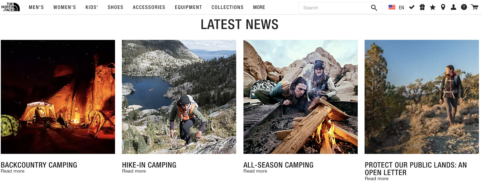
Who's Getting It Right
The North Face excels at driving narrative consistency between its brand and its images. Throughout its website, the images are packed with adventure frames, people braving the elements, and clean, crisp no-frills compositions, which all align perfectly with the brand's personality and its slogan: "Never stop exploring."
Who Needs Some Work
Grand Canyon National Park's website provides tons of useful information that tourists and locals can use to get the most out of their vacations, but the imagery on the site lacks the same refinement and continuity. Original photography and stock photos sit next to illustrations and animations, all without the consistent filtering and color palette needed to bring a cohesive brand look and feel.

4. Spatial Relationships and Page Layout
The mantra, "A place for everything and everything in its place" is about more than organized drawers and a clean room. When it comes to your visual identity, spatial relationships and the layout of imagery and text can have a major impact on your audience's ability to navigate your site and engage with your content. If your page is too cluttered, it could overwhelm a user; if it's too empty, it may appear unfinished or unimpressive.
The Power of Spatial Relationships: Guiding Attention
Aesthetic choices and page design layouts directly affect users' engagement with your brand. They can also affect how much audiences trust your brand. One study found that upon first viewing a brand's website, 94 percent of participants distrusted the organization if its page had a problematic design. The study goes on to say that cluttered, boring, and busy layouts may trigger distrust and confusion.
Understanding how audiences navigate content requires a basic familiarity with the Gestalt principles of grouping. In the 1920s, psychologists Max Wertheimer, Kurt Koffka, and Wolfgang Kohler developed the Gestalt (German for "unified whole") principles of grouping, which describe certain laws of perception. Humans group visual elements that look alike, for example, or elements that are in close proximity to one another. Ultimately, these principles explain three major tenets of human perception:
We see the whole before we see the parts.
The whole is different than the sum of the parts.
We instinctively make patterns and groupings with the parts.
Think of the first tenet as your audience's first impression of your site, and the second as your audience's journey through your page. The third tenet is how your audience processes the page as a whole and, from there, forms their perceptions of your site.
What It Means for You
A logical flow of text and imagery helps guide your audience through your site. English-reading audiences tend to automatically follow a Z-path pattern (top-to-bottom, left-to-right) when viewing images and webpages, which mimics the way they scan written content. If these users encounter too much of the Z-path in your page design, though, they will often resort to skimming or glossing over areas that don't stand out.
A well-laid page can guide users out of the Z-path and encourage them to engage with particular elements. Consciously organizing the elements of your page in a container hierarchy can help you direct the way audiences interact with your content.
When you're laying out your site, it's critical to leave room for your content to breathe. This can be achieved through the use of white space and gutters. Remember, a thoughtful layout is key to helping audiences navigate your site.
Layout Terms You Should Know
Above the fold: the portion of a webpage that is visible before scrolling downward
- Artifacts: graphics, objects, or other marketings that are not part of the authored content
Containers: the elements of a page that hold content and give the page structure
Gutter: the space between containers on a page
Grid: the structure of the containers that make up a page
Waffle-iron grid: a standard structure of nine (sometimes more or less) equally sized and positioned containers
Hyperframe/margin: the space around the edge of a page
Multiframe: the space around the entire design asset (not just a single page of that asset)
Rail: the vertical containers that run along the right or left side of the content body
White space: blank space between and around containers that helps the content breathe
When assessing the layout of your pages and content, consider these questions:
How are you prioritizing the elements of your brand page? Is there an intentional hierarchy in your layout?
- What impression will audiences get from your layout? Does it present confidence or insecurity?
- Is the page too cluttered? too sparse?
How does your layout guide eyes through the page? Is it effective?
Does your page follow the Z-path reading pattern? Or does it direct audiences to different corners of your site?
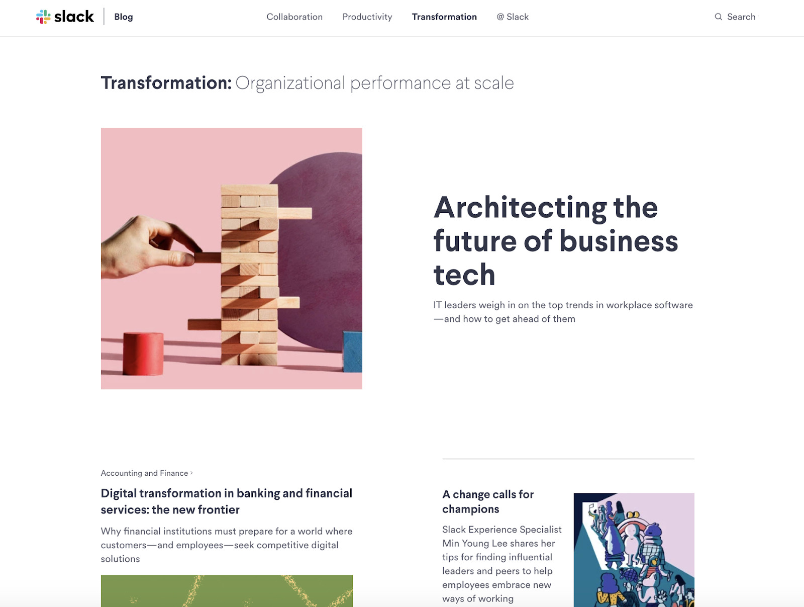
Who's Getting It Right
Thoughtfully placed containers of varying sizes help prioritize content on Slack's blog without overwhelming the reader or forcing them to scroll. The brand sets off different content categories with a standard heading style, but different container configurations, which sparks visual interest while signaling a subtle change in the nature of the content the reader is viewing.
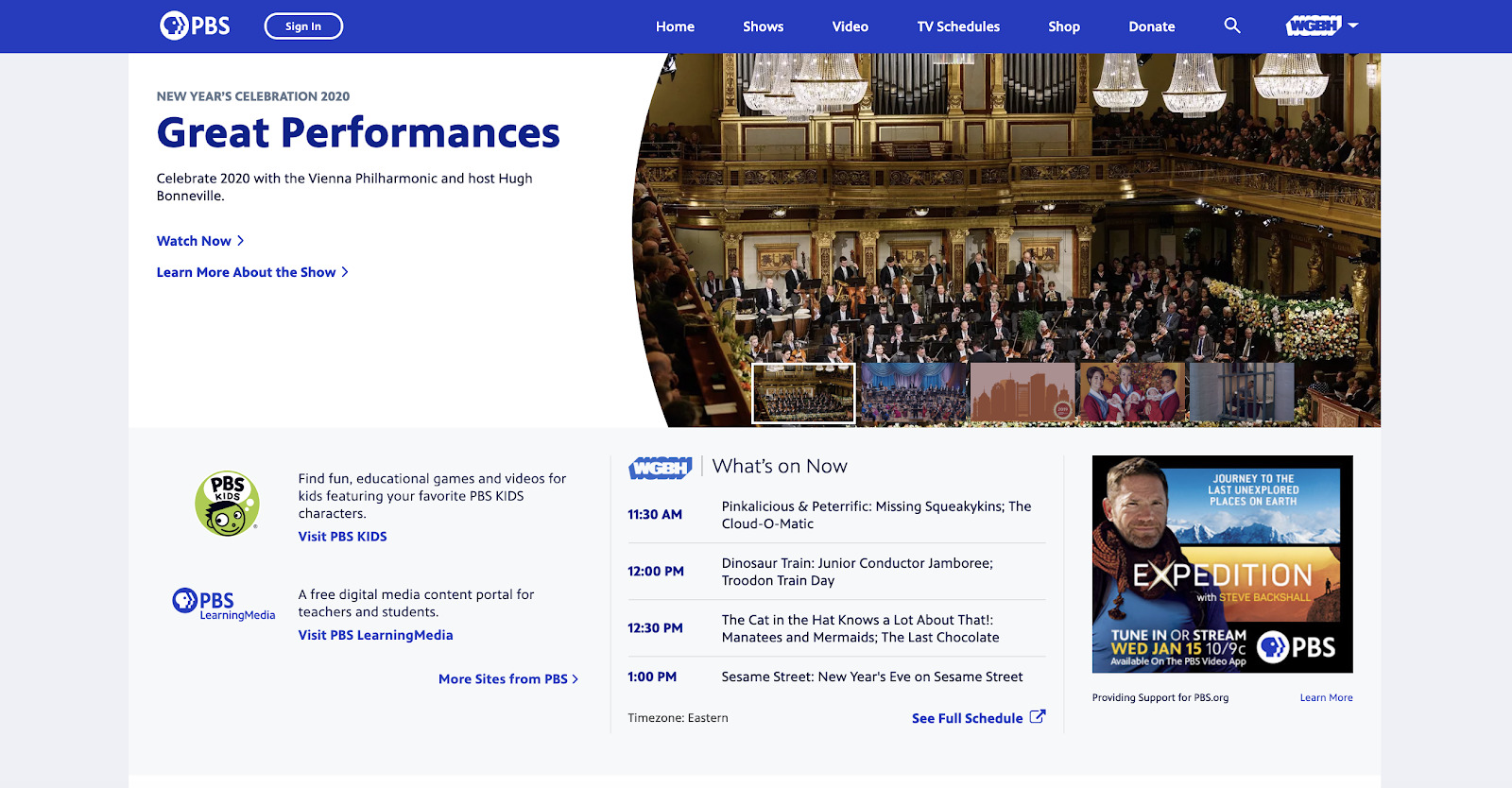
Who Needs Some Work
Giving elements room to breathe is important in webpage design. However, too much white space can leave your site looking like a work in progress, as is the case with PBS's landing page.
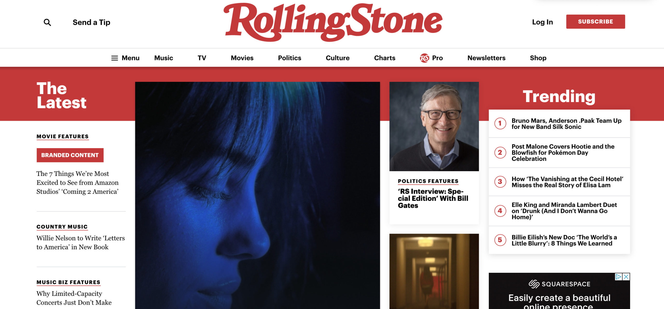
Alternatively, Rolling Stone missteps by overcrowding its page. Too many containers and an overuse of rail space make this page feel cluttered and disorganized.
Show the World What Your Brand Stands For
From color palette and typography to imagery and layout, your brand's visual identity is central to how audiences will perceive, interact with, and share your content. Using the best practices and insights presented in this thought leadership asset, you can begin to finesse your visual identity. However, keep in mind that establishing a visual identity isn't a one-size-fits-all exercise, nor is it a one-and-done process.
What works for one brand may not work for yours, and what feels like a solid visual identity today may be completely off a year from now. Not only is it important to strike a balance between brand consistency and design best practices when forming your visual identity, but you'll also want to ensure that your aesthetic choices accurately represent your current mission, values, and vision.
You are the expert of your brand, and it's up to you to ensure that its personality rings true in everything you do, from the design of your website to the fonts you use in your content. You'll also need to choose images that represent your brand and its audience. After all, as the old adage goes, "Seeing is believing." If your audience likes what they see and feels seen, they're likely to support your brand and look forward to whatever it does next.
Featured image attribution: Mahir Uysal on Unsplash
Related Articles
Keep Reading...
Related Posts

How to Scale Content Creation with AI-Powered Atomization
Tuesday, November 26, 2024
Content Strategy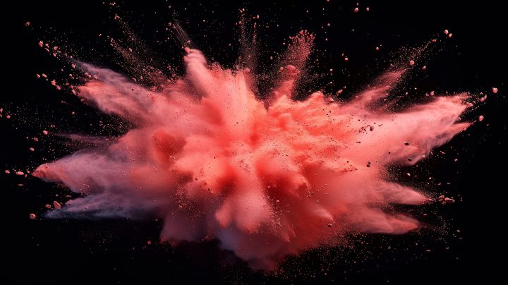

The Challenger’s Playbook: Brett Hannath on Leading Intel’s Marketing in Transformational Times
Thursday, November 21, 2024
Content Creation