Marketing
The 4 Best Graphs for Revealing Trends in Marketing Data
By Skyword Staff on October 1, 2020
A picture is worth a thousand words, but—at the risk of stating the obvious—images that send a message are really hard to make. For evidence, note the abundance of tools like Rhonna, Diptic, Infogram, and Easel.ly that make it possible for the unfortunately non-artistic (like myself) to make passable images for social properties, blog posts, and various other marketing materials.
But, general emphasis on design notwithstanding, the non-designer design revolution has left one of the simpler areas of visual communication in its dust: the graph.
The graph is the original infographic. It's the ideal vehicle for conveying complex information. Besides that, it's easier to make than an infographic, quicker to create than a narrative, and an ideal means of communicating four basic types of information. Specifically, information about:
- comparisons,
- composition,
- distribution, and
- relationships.
Comparisons, compositions, distributions, and relationships are important to all marketers. Still, whether it's image-creation-fatigue, or a preference for plain text on field of snow white paper, graphs are woefully underutilized in marketing reporting, even when the information conveyed is graph-ready.
Good graphs (and charts and histograms) speak for themselves, and can improve the efficiency of reporting on the marketer's side while reducing the impulse to tl;dr on the reader's side. Graphs are good. And they become easy, once one has a good understanding of the types of charts that best convey the information at hand.
There aren't any rules for graphing, but judgment requires information. So, herewith are 4 of the best graphs for marketing data, and tips for matching a chart type with your data sets:
Type 1. Comparison Graphs show how variables interact with one another.
Bar (a.k.a. Column) Charts are best for comparison of variables in a few categories.
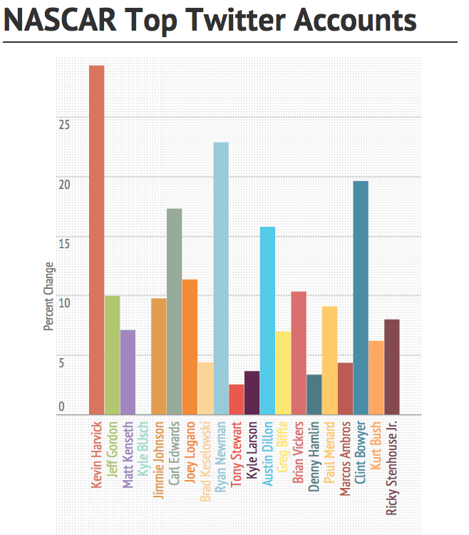
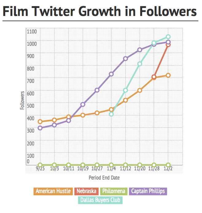
For example, percent change in Twitter followers by account, or Twitter follower growth over time!
Line Charts are excellent for showing one or more metrics over a period of time, they can also be used to show correlations.
Type 2. Composition Graphs show how different variables inform a whole.
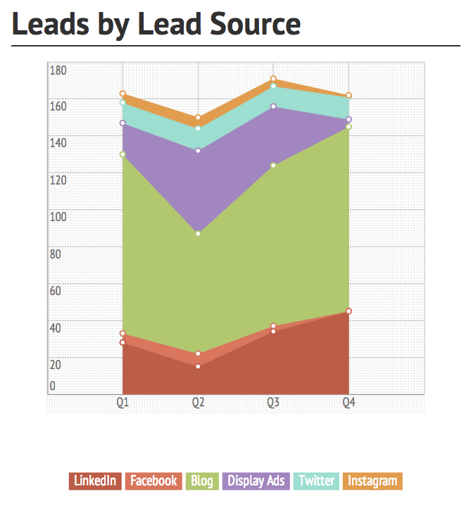
Stacked Area Charts are excellent for showing cumulative composition over time, like the percentage of leads from each marketing channel.
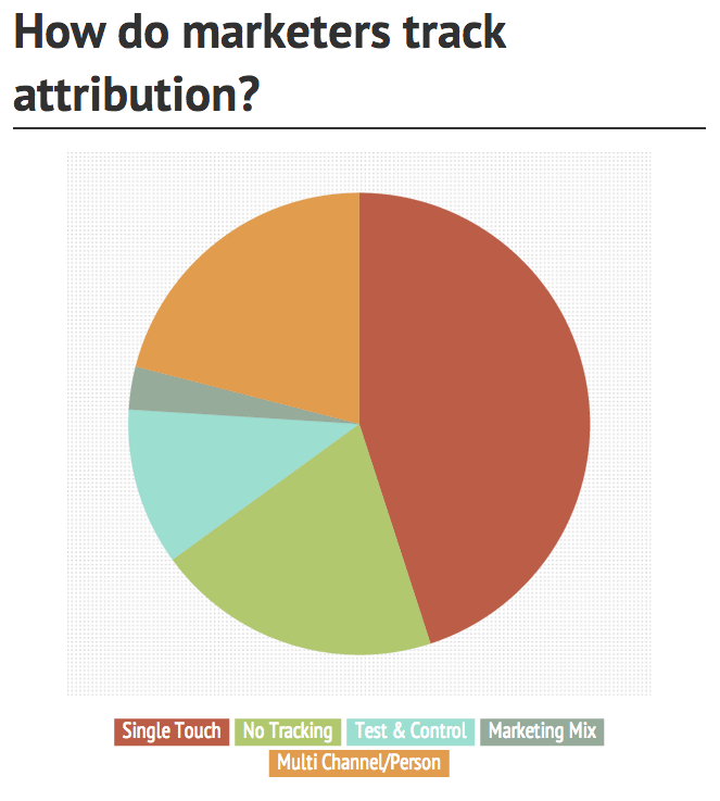
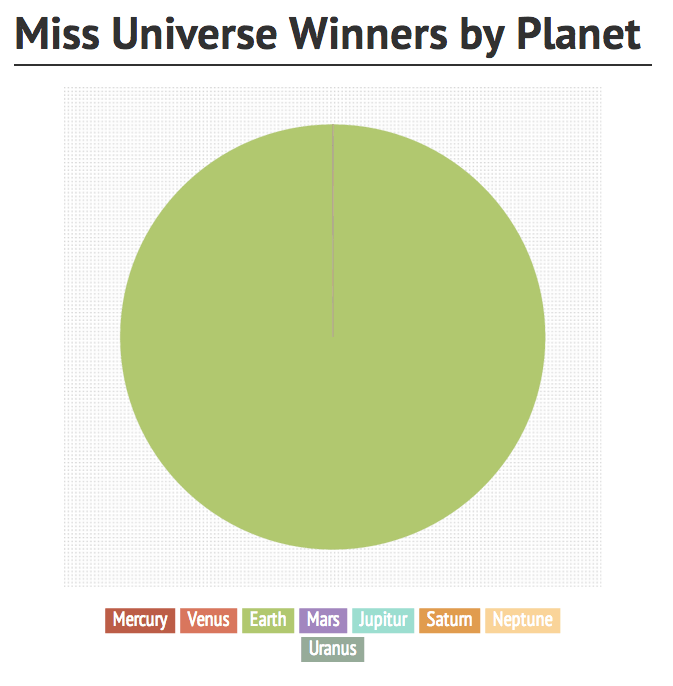
Pie Charts are ideal for showing the percentage of a whole allocated across several variables. For example, a breakdown of how marketers track attribution.
Alternatively, Miss Universe winners by planet!
Type 3. Distribution graphs can show how and whether correlations occur.
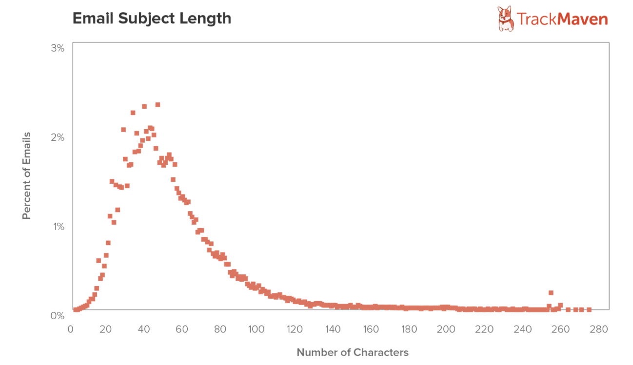
Line Histograms are ideal for showing a single variable with loads of data points. Note that both values need to be numerical and ordered—one dimension is always going to be a frequency!
Type 4. Relationship graphs show how two or more variables relate to one another!
Scatter Plots are ideal for mapping correlation of two variables (we often look at opportunity size v. days to close the deal), while Bubble Charts are like scatter plots for mapping the correlation of three variables, i.e. marketing technologies by adoption, value, and effort.
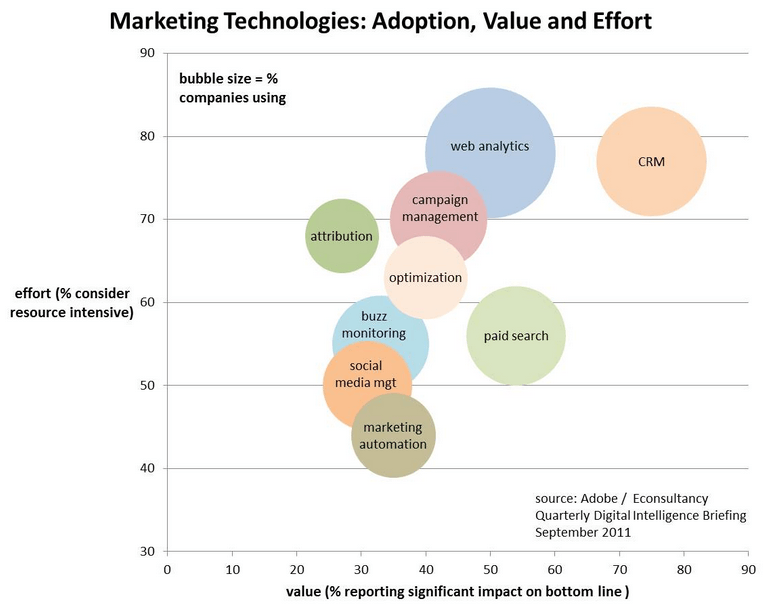
Image via Customer Experience Matrix
So, next time you're faced with making a Word document describing comparisons, compositions, distributions, and/or relationships or, alternatively, a million-slide powerpoint, try a graph!
If you're keen to choose the best graph type for your data sets, we can't recommend this resource from Extreme Presentation enough!
For more fresh perspectives on today's marketing trends, subscribe to our monthly newsletter, Content & Context.
Featured image by Lukas from Pexels.
